Web 2.0 Tool Review: Piktochart

Infographics are charts, diagrams, or visual images that communicate a message using little words. The purpose of an infographic is to for a person to walk away from it having learned something without having to do a lot of reading. The above infographic was made using an online application called Pikotochart (http://piktochart.com/).
Pikotochart is primarily a communication tool. It has a variety of pre-made designs that are ready to go. You can enter in new information, change up the design and graphics, insert your own images, and shorten or lengthen the infographic. The canvas is extremely flexible and quite easy to use. You can also create your own graphic from scratch.
Piktochart in the context of Education
Similar to my review on thinglink, Piktochart can be used for many educational purposes that call for the display of main ideas:
- Timelines (Similar to my above example)
- Book Reports (Explaining main ideas)
- Information Page (That's what I made!)
- Map (There are a lot of map options to show statistics make comparisons)
- Processes and Cycles
Advantages and Disadvantages
Advantages:
- User-friendly interface
- Regular computer short-cuts apply (Ex. Ctrl+Z)
- Lots of design options
- Free account available
- Free account comes with VERY limited pre-made design options (maybe only about 20 free)
- Charts do not come with concept maps
Before Using
There are very little requirements. The user must have basic computer navigation skills, an internet connection, and updated web browser.
How to Use
1. Register for an account and log in.
2. Select a design.

3. Name it.

This is what your screen should look like (with the exception of the infographic design). Notice that the canvas is organized into certain blocks. To edit a block, just click on it and the particular item that you want to change.

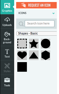
4. On your left side, you'll notice different tools. Let's look at the Graphics and Icons tools. You can use the search bar to search for a specific item or click on the drop-down menu to select a category of icons.


5. Let's skip down to the Tools icon. Here you can find and insert more multimedia to present more detailed information.

If we click on the CHARTS option a spreadsheet similar to Microsoft Office's Chart's spreadsheet will appear. You can edit your chart design and contents by changing the input values here.

6. Edit pre-made text by clicking directly into the block and text. Add text by clicking on the Text icon from your toolbar on the left.

7. Save or publish your work. The options are located on your top right-hand corner.
Other Thoughts
I was very impressed that Piktochart had so many chart options, including the spreadsheet to manipulate data. I was a little dissapointed that there were no concept mapping tools, though. I was also frustrated that there were so little free pre-designed infographics, but it's FREE, so it's hard to complain. I recommend Piktochart for those who want to present information using detailed data. However, I would not recommend it for people who want to create a minimalistic infographic.
If you haven't checked out Canva (www.canva.com) yet, I highly recommend it and prefer it over Piktochart for creating infographics, posters, covers, and a variety of other things that aren't available on Piktochart. Canva is also free and comes with a large amount of free graphics to enhance your design.


Comments
Post a Comment